EN
Blog
- There’s no eject option. One can simply physically remove the drive.
- There’s no way to rename the flash drive on the Supernote. Renaming it on my computer did not affect its functionality.
- Supernote files can be copied or moved to the drive, and I was able to edit notes on the drive, just like I demonstrated with the expansion card.
- The drive doesn’t appear in the list of folders that can be synchronized with the cloud.
Curious about my minimalist Obsidian setup? A detailed video is coming soon, with screen recordings from my real account, showcasing most of my workflows. For instance, why only five plugins? This will probably be one of the longest videos on the channel. Due to that and the necessary blurring, it’s unlikely I’ll be able to release it today. However, tomorrow seems feasible.
I always wanted to produce my content in English
When I started my YouTube channel in English three years ago, I thought it would be one of the most challenging things I’d ever do. I always wanted to produce my content in English, but fear held me back for years. Thankfully, I finally took the plunge.
Despite living in the US several times, I’ve always struggled with the language’s nuances and quirks. I’m sure you can easily remember at least one time I used the wrong pronoun, verb, expression, or pronunciation. I can clearly see my mistakes in older videos.
Yes, I do watch past videos, as this helps me do my best to improve with each new one, but English will never be my first language, and mistakes are inevitable. The bright side is that things are getting easier every day. Or should I say less hard?
But why simplify when you can always complicate a bit? I have published books before, but always in my native language. As some of you may be aware, I recently started writing a new book, but this time in English. Which, like the channel on YouTube, has been just as intimidating.
Thank you for your patience and support. You guys are spectacular! By the way, what’s something that scares you? Maybe it’s time to take the leap and do it!
PS.: This is the first video I published in English. However, the channel is not only about Evernote anymore.
From time to time, I go on a quest searching for a basic macOS photos app that reads images from a folder on my computer, like Picasa did before Google bought and discontinued the app. I could never find a good option. Any suggestions?
I opened Mastodon, and suddenly, I’m reading posts about the Apple event from Threads, Flipboard, Micro.blog, Medium, and even Mastodon 😊. All in one place! The Fediverse and the ActivityPub protocol are mind-blowing. What a time to be alive!
This book weighs 1.1 Kg
That’s insane. It is likely the 786 pages containing text plus four inexplicable blank sheets at the end. Anyway, I picked this one up secondhand because it’s out of print and there’s no e-book version I know of.
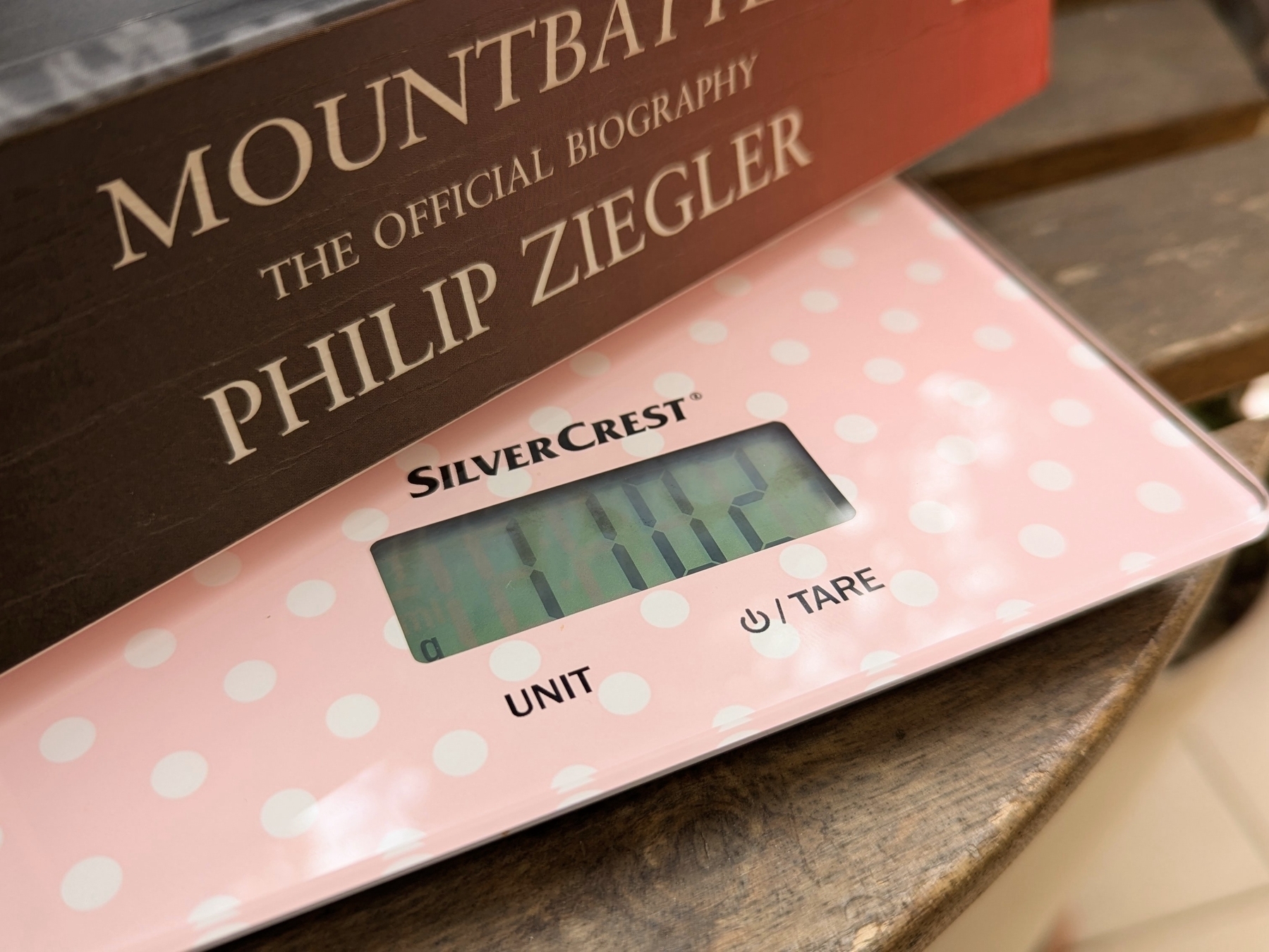
I love reading on subways, trains, and planes, but, as you can imagine, bringing this book with me is always a challenge. It’s like reading and doing cross-fit at the same time 😂. Not to mention how unbalanced it was to hold when I began reading it. Now that I’m reaching half of it, it’s easier to manage. But as soon as I cross to the other side, things will become unbalanced again.
That’s probably why it’s taking me ages to finish it, so I came up with a plan to make it more portable. I started testing my idea yesterday and just completed the process. I can now read it on my Supernote, and you can learn how I did it watching the video below.
On how am I rediscovering my creative freedom with digital scribbling.
The Supernote is helping me to rediscover the joy of handwriting my scripts. It’s like using magical paper to seamlessly capture and reorganize ideas.
Years before Evernote, I would write many of my first podcast scripts on any piece of paper I could get my hands on. I’d usually have the ideas during of after jogging, and it still happens today for the YouTube videos. But even though writing them down was a great way to remember later, trust me, the final “document” was typically a big mess.
Let’s be honest, it’s tough to keep handwritten notes as organized as a bullet list. Ideas don’t always flow in a neat, linear way, so it can be a real challenge to make sense of them later. My drafts were often ugly and pretty challenging to understand because of all the small text inserts. On some occasions, I would use arrows and even a second piece of paper with numbers on both parts of a sentence to try to connect them. I suppose you can imagine that it was often difficult to decipher.
In hindsight, I’d say I moved to digital writing as soon as technology was portable enough, probably because of the impossibility of inserting new text in between lines on paper. When I finally started using a Palm, I wrote down so many notes on it that I became an expert at using the Graffiti alphabet.
Today, I frequently write on my computer; however, typing comes with its limitations. For example, sketching can be difficult to integrate with typed text. That’s great on paper, but again, there are all the problems mentioned above. Furthermore, I’m not good at drawing, so I frequently have to erase and fix things as I go.
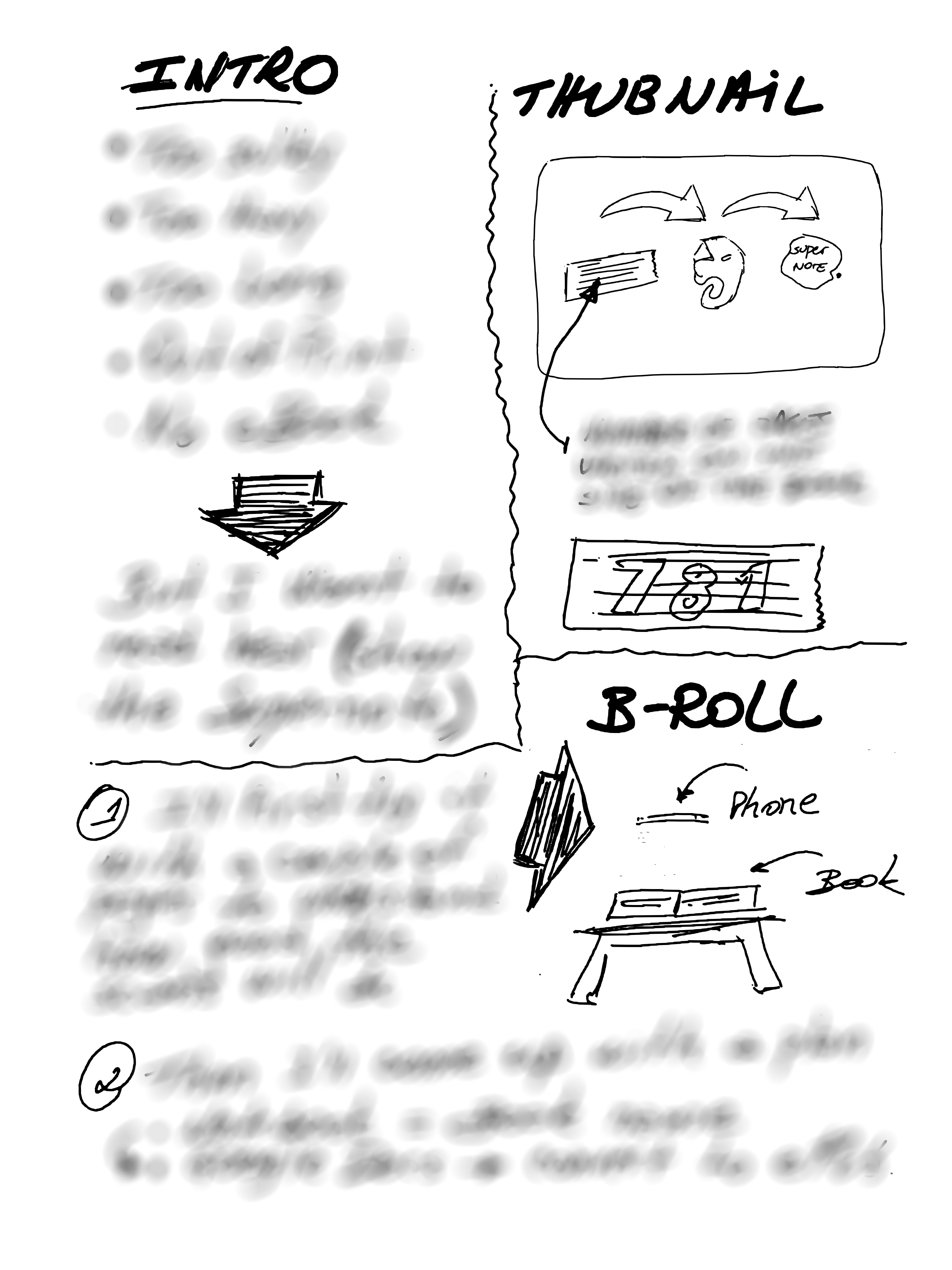
For example, the thumbnail you see in the image below was created at a much larger size. It was the first thing I did on that page. When I was happy with it, I resized it to fit the corner of the screen (paper?). All the text you don’t see — more on that in a moment — was rearranged several times as I was writing, just like the pieces of a puzzle slowly falling into place.
It’s impossible to do that on paper, but the Supernote brought back the freedom and joy I remember having many years ago, and improved the process. It is like having the best of both worlds. And the most convenient part is that I can easily send the final version to Evernote or Obsidian.
As for the hidden text, there’s no secret there. I’m just trying to keep a mystery aura because I have already started to produce this video and don’t want to spoil the surprise. But if you cannot contain yourself, the untouched drawing is available for supporters on Patreon and YouTube.
Anyway, I think that you can probably tell by the thumbnail and the other drawing that the video has something to do with sending content to the Supernote via Evernote.
Obsidian Canvas as a resources space with images and PDFs—my new experiment
I have a new idea that I’d like to share with you. Yes, again. Changing things up, like I’ve been doing lately, makes me feel inspired.
I believe I’ve finally found a good way to use Obsidian Canvas. Instead of creating notes just to be able to filter them by tags, I’m trying Canvas groups for images or PDFs.
This approach may not work for everything, but the zoom in and out feature may make it easier to find the resources I use on my Maker and IT-related projects, especially when compared to sorting notes by tags. It’s a visual space, so I believe it will be easy to spot the item based on the color and format of the image or PDF. Time will tell, though.
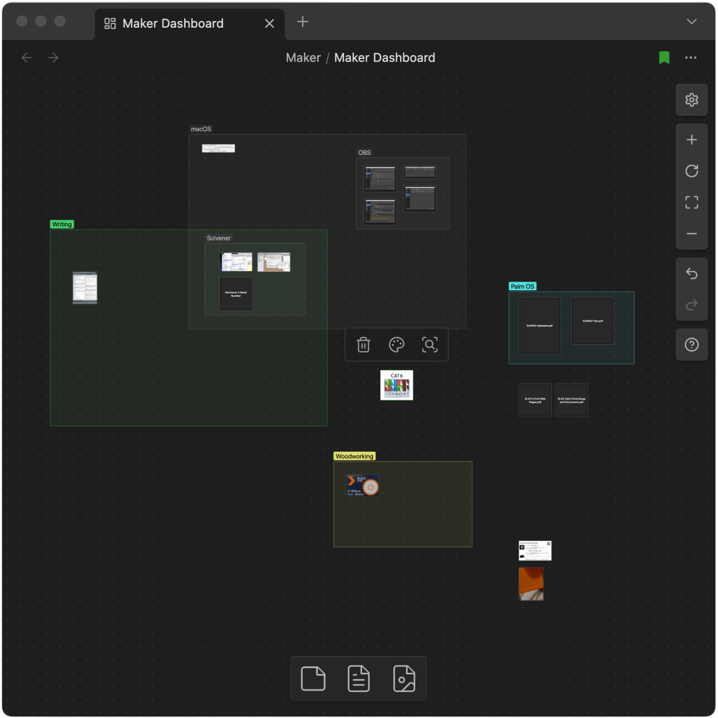
For testing how efficient, or not this will be, I’ve created the “Maker Dashboard” Canvas that I’m using for everything related to my creativity process. For now, it has just a few notes (image above), and the following groups: macOS, Writer, Woodworking, and some loose content that I’m sure will end up being grouped with other future images or PDFs.
Side note: Keen eyes will notice that there’s also a “Palm OS” group, and, although it is not possible to clearly see, there are some images related to other vintage passions of mine next to that group.
And just like what I mentioned yesterday regarding the single folder for all my pictures, all these files can also be easily added to other Obsidian notes, or used from my computer file system.
Consolidating all photos into one Obsidian folder
Since I am currently on a reorganization spree, I decided to experiment with an idea. Currently, I have multiple subfolders for images used on my blog posts, Journal, Office, and Home folders on Obsidian. Maybe even others. One thing I always wanted to try was to have some folders dedicated to certain types of files, such as images, PDFs, etc.
Here’s the plan. I’ll consolidate all the images into one folder, which will serve two purposes. First, it will work as an album. However, it will also serve as a centralized storage space from which I can drag pictures to use in any of my notes.
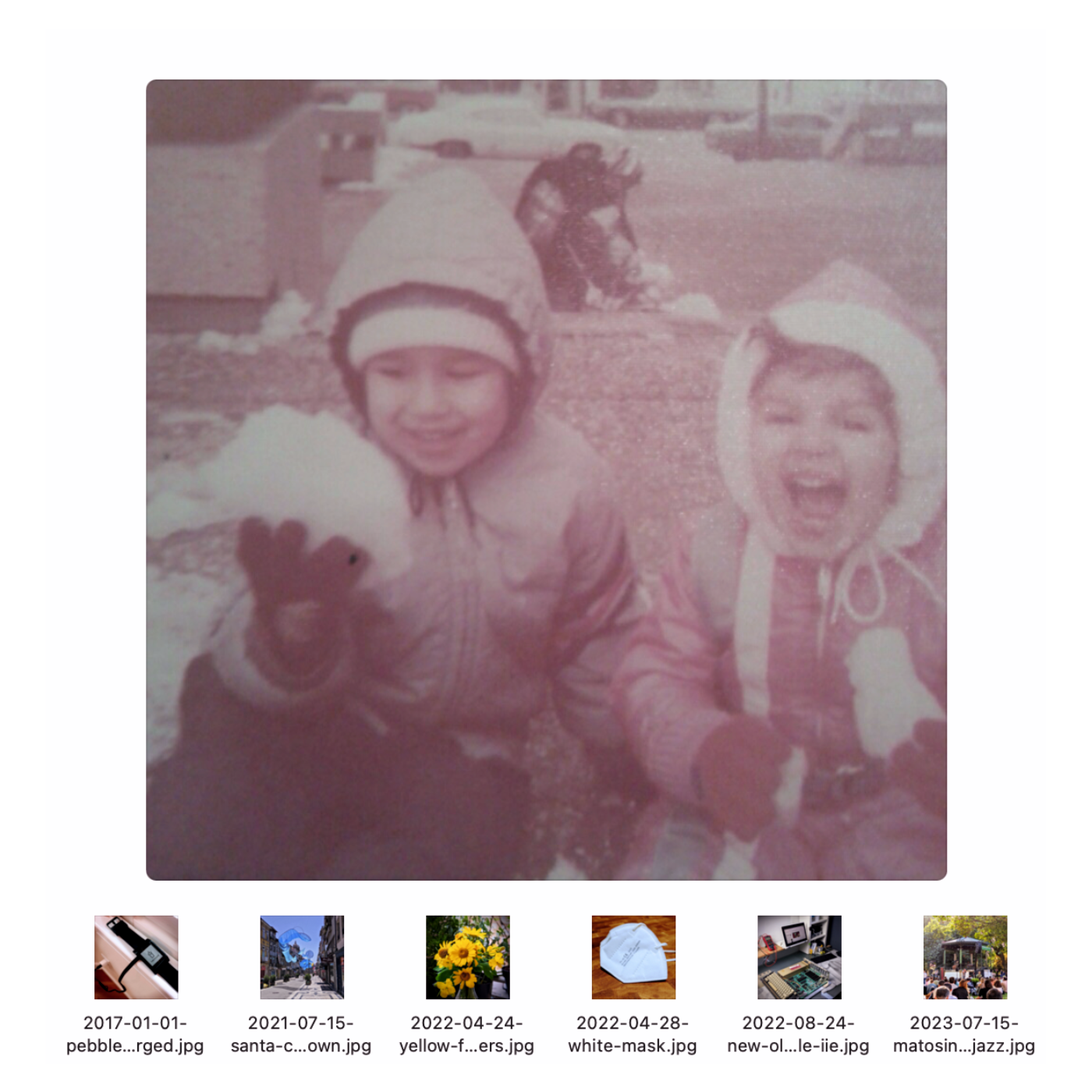
And because of the way Obsidian works, those pictures will also be easily accessible from the computer’s file system if I need them for other projects. Below, you can see how easy it is to interact with the images using the Mac file system (Finder). By the way, the kids in the picture are my sister and me, captured during my first move to Boston. I absolutely love that city.
Another benefit is how straightforward it is to save pictures there. I can simply use the “save as” option on any image editor and choose the Photos folder on the file system, which in reality is located in Obsidian.
I’ve successfully moved 40 images and am pleased with the results. But there’s a catch. Because of the way I imported some of my content to Obsidian, the creation dates of many files are all messed up. So, I’m also adding the date (YYYY-MM-DD) to the beginning of each file name (thumbnails above). This will help me see the pictures in chronological order by ordering the files alphabetically. I hope that makes sense.
If this works, I may try the same with PDF files. Stay tuned.
I’m down to 5 plugins on Obsidian now, and I’m happy with that. However, there is still work to be done regarding the organization of information between Obsidian and Evernote. 🤔 Maybe there is an opportunity for a video on this.
Unraveling the mess I created using Evernote and Obsidian
I don’t have any clients today, but I’ve decided not to write scripts or edit videos. I am putting my energy into unraveling the mess I created after simultaneously using Evernote and Obsidian for a while now. Both have strengths and weaknesses, so my goal is to figure out what to use each one for.
There are things I can easily piece together. For example, I love how Evernote handles tasks, and I find the Obsidian Tasks plugin overwhelming. The same is true for the calendar. Evernote does a much better job of bundling it with our notes. At least, in my opinion.
But Obsidian is so well integrated into our computer file system, and I love to use that when creating my Unexpected Workflows.
Roughly speaking, the plan is to keep tasks and business-related content in Evernote. Especially meetings with clients and companies I collaborate with. As for Obsidian, it will still house my Knowledge Base, as it deals much better with PDFs, blog posts, and files I’m currently using (or used) for my books, courses, and video production.
I am also trying to keep the minimum number of plugins possible, having already removed many of them. That includes—don’t panic!—Davaview.
As for my personal documents, that’s still undecided.
And while testing all the ideas above, I’m experimenting with posting without using titles. After making so many posts today, I am looking at it as a far better formatting style for the blog, as well as a much cleaner way to cross-post to other social media platforms.
How to reset the Garmin Instinct 2
My Garmin Instinct 2 screen froze Sunday before a run, and even though there’s a surprisingly simple fix, it took me a while to find it. So, here it is, in case you need it.
To reset the Garmin Instinct 2, hold down the CTRL key for about 15 seconds. The screen will turn off, and after a few moments, it will come back, showing the Garmin logo. If it doesn’t open your selected watch face from there, just press CTRL again for a few seconds.
This was the very first time I had any problems with my Instinct 2. It’s remarkable how reliable this watch is. I love it and stand by everything I said in my first impressions video below.
Connecting a USB-C flash drive to the Supernote
Some people were asking me this, so I decided to test it. So I bought on to understand how the Supernote deals with it.
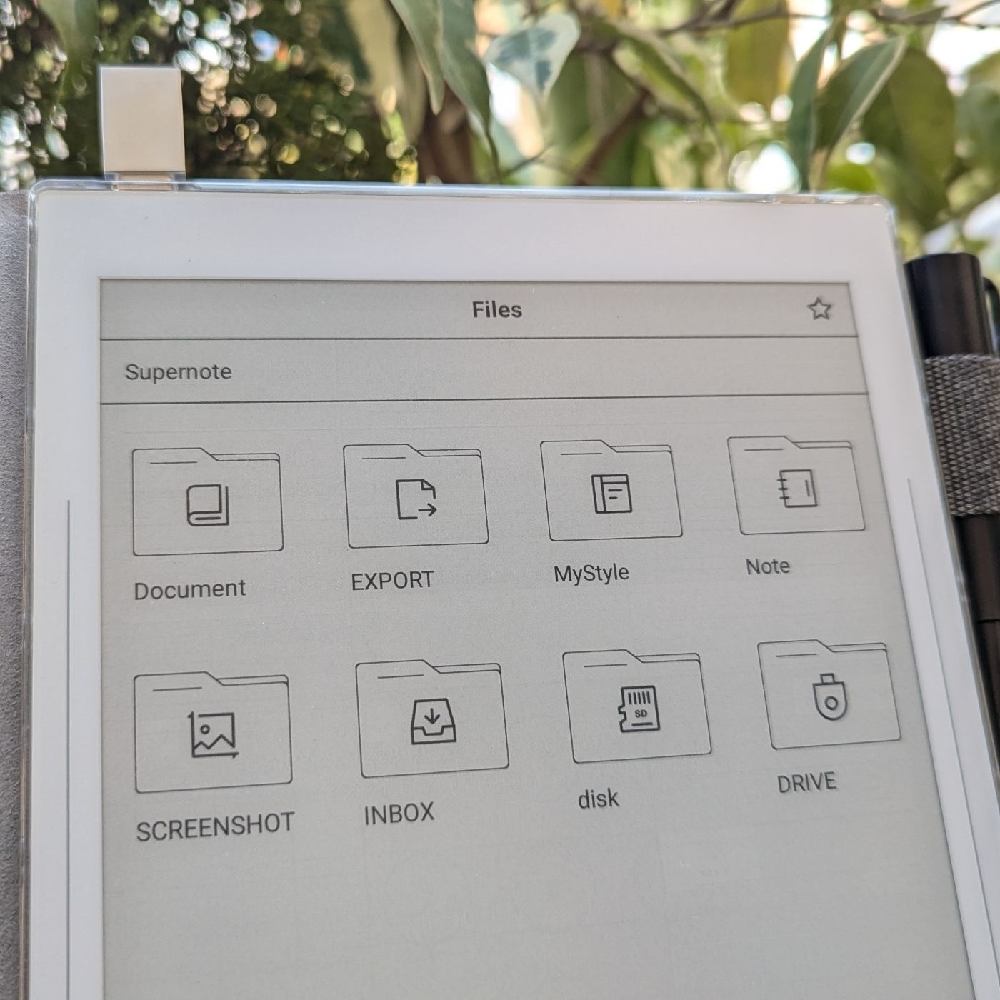
It is possible to connect a USB-C flash drive to the Supernote. Thus far, I have discovered that:
How I listen to books on my Supernote Nomad
Remember my rant about the microSD expansion on the Supernote? It appears that it’s not as limited as I thought.
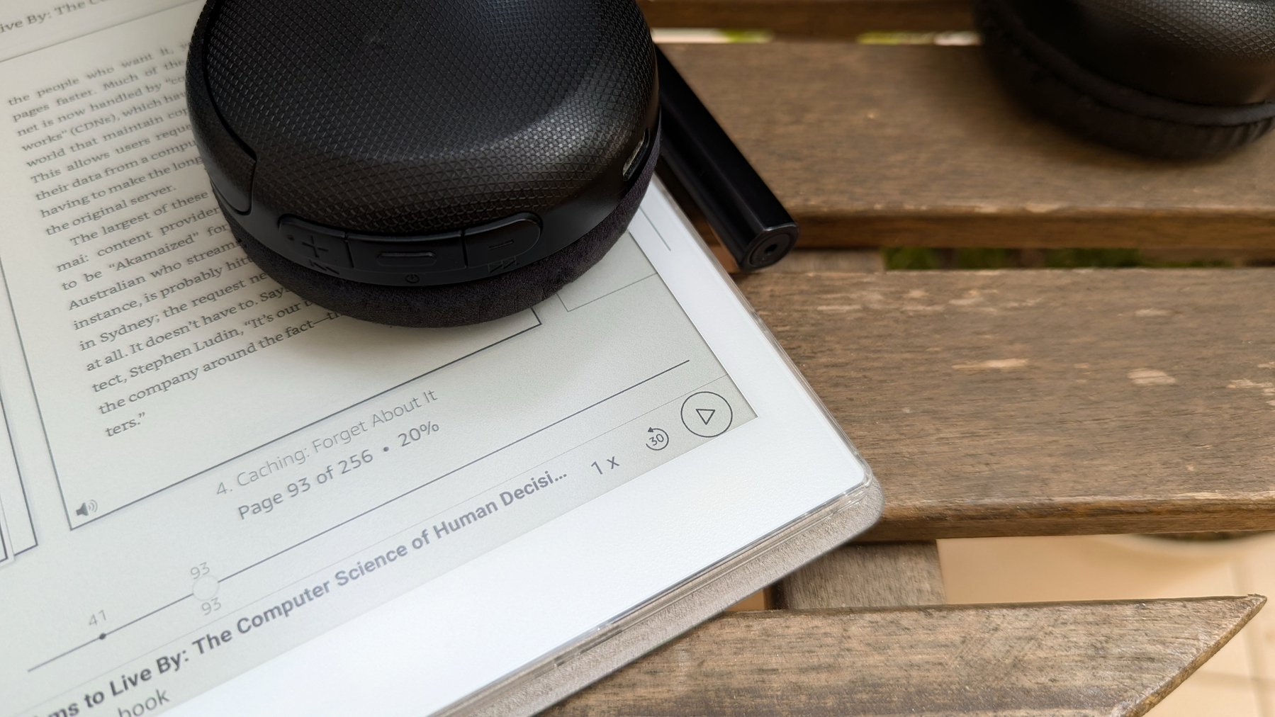
Yesterday, I was feeling a bit frustrated, as I couldn’t figure out the full potential of using a microSD card on my Supernote Nomad (A6X2). But today, I stumbled upon something that started to change my perspective.
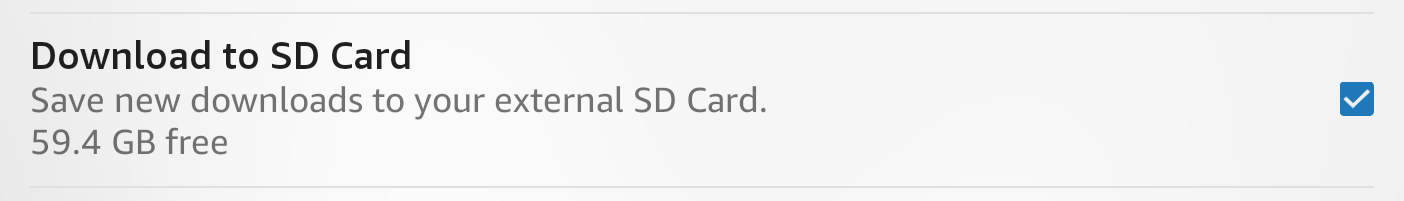
It turns out the Amazon Kindle app has a hidden gem: the setting that lets you save all your books directly to the expansion card on your phone also exists on the Supernote.
To activate it, simply open the Kindle app, go to More, and then Settings. There, you’ll find the option Download to SD Card.
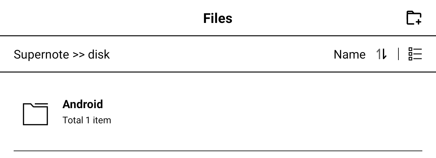
After enabling this setting, I checked the card and found a new Android folder that looked remarkably similar to the one on my phone. That’s interesting to learn.
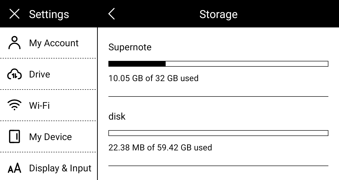
Finally, I went to the Supernote storage settings and confirmed that the card was indeed being used. But there`s more!
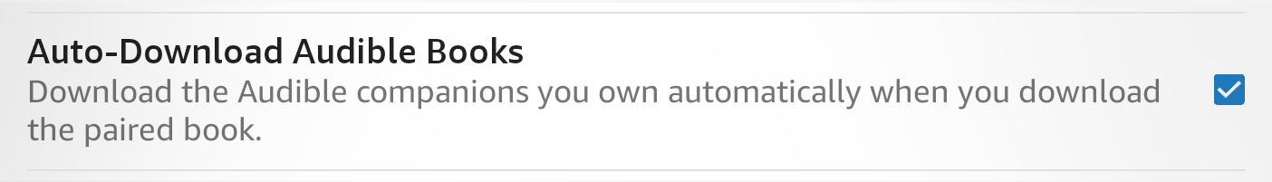
Now that the books are being stored on the card, I decided it would be worth it to try downloading and check if I could listen to audiobooks. There’s no headphone jack on the Supernote, but it is possible to connect a headset via Bluetooth, and I had to try this. By the way, there’s also an option in the settings to auto-download your audiobooks.
And the answer is yes, it is possible to listen to audiobooks. That microSD card is starting to look more promising now.
The Value of Experience
I feel foolish in retrospect for not considering some advice given to me by my parents and grandparents. Things change from generation to generation, and it’s easy to fall into the trap of believing they don’t know anything about our generation. The real lesson we seem to never grasp as young people is how to deal with life’s challenges and setbacks. And that’s generation-agnostic.
When I noticed my kids behaving just like I was in the past, I started each piece of advice with, “Do whatever you see fit with this information; I’m just telling you what happened to me”. Believe it or not, that made them at least pay more attention to whatever I was explaining. Only time will tell if it actually worked or not.
Have a lovely week.
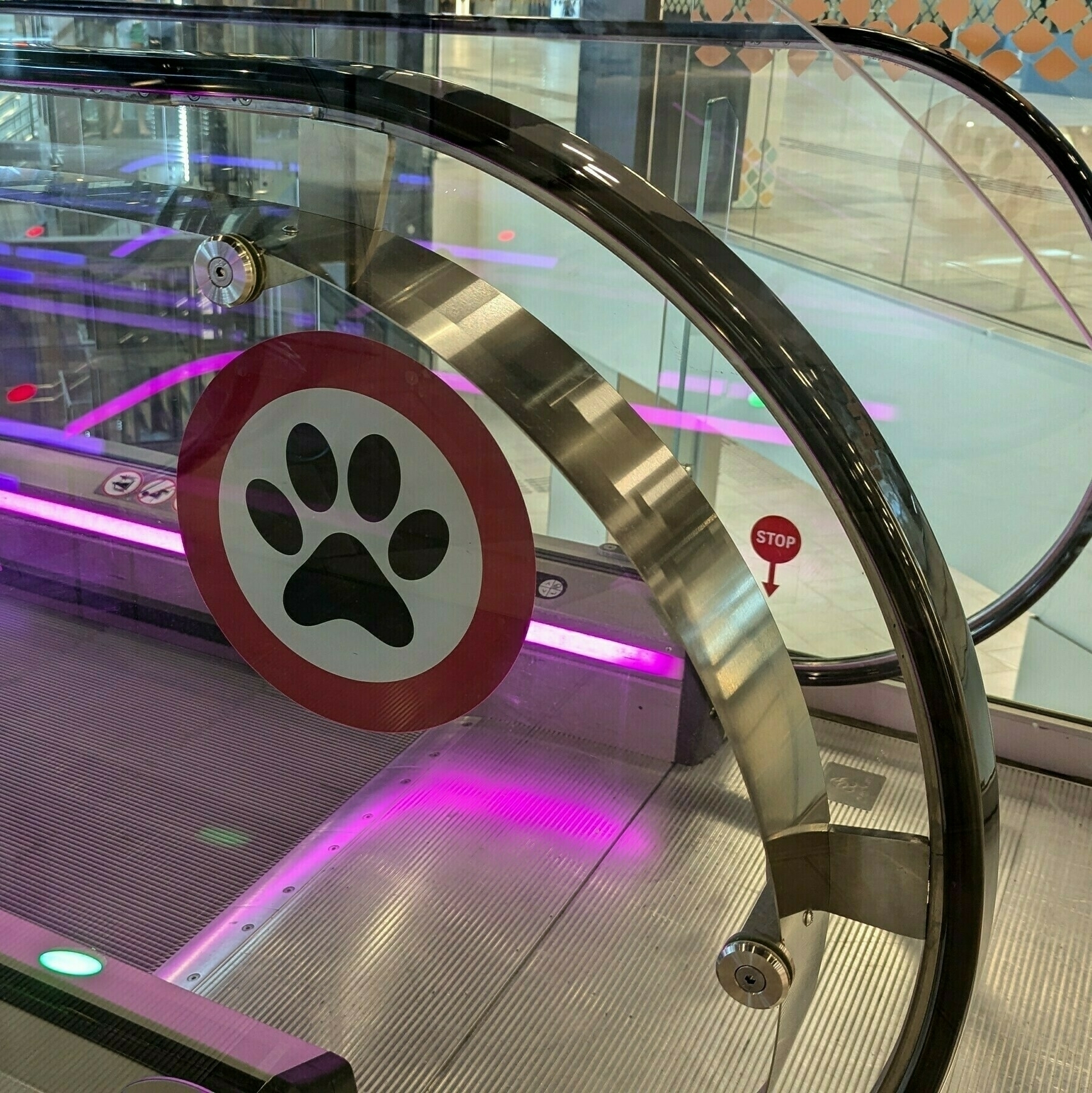
It’s always challenging to decide whether to bring my dog on our quick trips. Caffeine was not with us on Sunday, but I couldn’t help but wonder why I didn’t bring him. Every time we go to Galicia, we find new malls and shops like this. Thank you, guys, for helping us enjoy our furry friends even during the hot summer days 🐾
Will creators have to pay the price?
Apple’s App Store fees have the potential to make things harder for creators on Patreon.
As a shareholder, I understand that many of Apple’s decisions are driven by the need to make the company more valuable. But sometimes their policies go too far.
If the numbers presented in the video below are accurate, Patreon, the company, is unable to assume the App Store fees. I’ll even go as far as to say that it is mathematically impossible, as Patreon fees are lower than those of Apple. Which leaves two options: either the creator or the supporter will have to bear Apple fees.
I understand that Apple has a great system with almost zero friction, and that there are costs to operate it. What I don’t understand is the percentage. How can Patreon charge much less and even support all its operational expenses? Furthermore, does the amount charged by Apple even make sense when creators or supporters will be the ones paying for it?
My tiers on Patreon are pretty low because I’m not trying to explore anyone. I’m looking to build a community of people who are as passionate as I am and wish to help me by supporting my work. However, when Apple’s policies come into effect in the near future, I’ll have to switch to charging the App Store fee from the new supporters paying from there.
Apple, of course, is entitled to make its own business decisions, but forcing end users to pay more is unfair and, I dare say, unethical. Companies using the App Store should be allowed to explain that there’s a cheaper option to purchase a service. The way I see it, Apple is simply not giving users a choice.
This situation is another reminder that I have to keep my policy of not using any of Apple’s wall-gardened services, despite their quality. It’s also a good example of why the European Commission is constantly creating regulations to prevent big companies from doing whatever they want.
Entropy, the illusion of ultimate perfection, and the birth of the Timeline System
Remember the last time you spent hours searching for an important document or email? I’ve been there, too. I know how the frustration of not finding things can negatively impact our daily activities.
Many years ago, motivated by a lifelong passion for organization, I embarked on a quest to create a system that I wanted to be straightforward to adopt and use. It should have as few steps as possible to set up and use, and it had to be as natural as possible to adopt and maintain. As you can probably imagine, that’s much easier said than done.
Long before thinking about my system, when I started working for big corporations, I realized how much of a problem it was not having a simple way to find information and keep up with activities. However, after trying many existing solutions, it quickly became clear to me that they often felt rigid and unnatural, forcing users to adapt to the system rather than the other way around.
That frequently led to frustration, which in turn meant the team would slowly abandon the plan. But I didn’t give up. There had to be a better approach. Perhaps something more in tune with human behaviors. It would still take several years to find the right solution. In reality, I spent so much energy trying to make this work that it eventually became my job.
Even today, as a consultant, I still dedicate a fair amount of time to listening to how the person does things before coming up with a solution. I then try to build a workflow and adopt software or any technologies that better match how the person does their work. Experience tells me that this approach means more time and effort put into building the system, but it also means it will be a long-term solution.
Helping people resulted in a lot of feedback, which in turn led to the perfecting of the system. It was only over a decade of this feedback loop that I began to realize that basing the system principles and mechanisms on how people naturally think and do things was the correct decision.
I don’t claim to have found perfection because, in a way, it’s physically impossible. As Rudolf Clausius puts it,
“The entropy of the universe tends to a maximum.”
To which I add,
“So does the entropy of your notes and ideas. It’s okay to not obsess over a perfect system, as it is often a waste of your time. Remember that you cannot predict everything, as variables are forever changing.”
It now feels like all this journey has to be converted into a book. But although all these ideas have been in my head for so many years, it doesn’t make it an easy task to organize everything in a comprehensible way. It will take a while to finish, but rest assured that the Timeline System is being documented.
“The entropy of the universe tends to a maximum”
—Rudolf Clausius
So does the entropy of your notes. It’s okay to not obsess over a perfect system, as it may be a waste of your time. Remember that you cannot predict everything, and variables are forever changing.
If you are an Evernote user, and you are finding yourself lost in the multitude of information you created, try AI-Powered Search. It might surprise you 😉